
The Search Standard — Logo Redraw Brief
1. The brief
Mandate
Redraw the existing mark. Do not rebrand. Positioning, name, tagline, and color family stay. What changes is the rendering.
What the mark must communicate (in order)
- Disciplined operator — not a teacher, not a guru, not a software product.
- The phone as instrument — the doctrinal centerpiece of the methodology.
- Standard, not service — a system you join, not a course you buy.
- Quiet authority — closer to a private bank's letterhead than a billboard.
What it must not signal
- Online course / info-product
- Software / SaaS
- Coaching / personal development
- Recruiting agency (the category it is positioned against)
- Hustle, urgency, motivation, "transformation"
Functional requirements
- Reads at 16px favicon up to 200pt cover-page lockup.
- Survives single-color print (black on cream, cream on black).
- Survives engraving / debossing / one-color stamp.
- Survives 8pt set on a contract cover.
- Works as a standalone glyph and in lockup with the wordmark.
- No effects that depend on gradient, bevel, glow, or rim-light to read.
Inputs to keep
- Concept: the analog desk phone (handset).
- Color: weathered bronze (instrument-grade, not jewelry-grade) + ink black + cream.
- Wordmark: "The Search Standard" — serif, restrained weight, the existing emphasis architecture.
- Tagline rhythm: quiet, lean, essential.
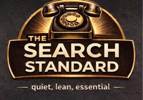
Inputs to retire
- Metallic gradient fill
- Heavy bevel / rim-light
- Sunburst frame behind the phone
- Decorative shield / plate
- Compressed, inflated-weight letterforms
The single test
Does the concept read first, before any effect, at any size, in one color?
If yes, the mark is doing its job. If no, redraw.
2. Option evaluation
Six directions the redraw can plausibly go. Each is a different answer to the same brief. The right pick depends on how literal vs. abstract the mark should be — and whether the phone stays as drawn object or becomes typographic.
Option A — Engraved Handset
A single-weight line drawing of a mid-century desk handset. Drawn like a patent illustration: thin, even stroke, no shading, no perspective tricks. Sits left of the wordmark.
- Pros: Most direct continuation of the existing concept. Keeps the equity (the phone) literally visible. Reads instantly. Engraves beautifully. Closest to "instrument" feel.
- Cons: Pictorial marks are the hardest to draw well — bad execution looks like clip art. Locked to a specific era of phone (risk of feeling nostalgic rather than timeless). Requires a strong illustrator, not a generalist.
- Best when: You want the phone to remain the brand's visual anchor and you can hire a designer with patent-drawing chops.
Option B — Phone Glyph in a Square
The handset reduced to a geometric pictogram — abstracted handset (two curved ends, a bar) — sitting inside a thin-ruled square. The square reads as "standard," "frame," "instrument plate."
- Pros: Strong system feel. Square plate doubles as favicon, app icon, document watermark, end-of-section mark. Geometric construction is forgiving to redraw at any size. Looks engineered.
- Cons: Risks looking like an iOS phone-call icon or a generic contact-card glyph. Has to be drawn with enough specificity that "phone" still reads as desk phone, not smartphone.
- Best when: You want a modular system, not just a logo. The square becomes a recurring brand device.
Option C — Monogram (S·S)
A serif monogram of "Search Standard" — two S's set in a custom or lightly modified high-contrast serif, possibly with a hairline rule between or under them. No phone in the mark at all; the phone moves to a secondary illustrative role inside documents.
- Pros: Most "private bank stationery" of the options. Maximum quiet authority. Scales effortlessly. Trivial to apply across documents, embossing, stamps. Doesn't depend on illustrator skill — depends on type skill, which is more available.
- Cons: Abandons the phone as the primary visual — biggest break from existing equity. Monograms are crowded territory (looks like every law firm, family office, and boutique consultancy). Has to be very well-drawn to not feel generic.
- Best when: You want to lean fully into the "professional system" positioning and you're willing to demote the phone to a supporting illustration.
Option D — Wordmark only
No glyph. The mark is the wordmark — "The Search Standard" set in a refined serif with carefully controlled emphasis ("The" smaller, "Search Standard" carrying the weight, or italic vs. roman play). The phone disappears from the identity entirely and lives only inside the content.
- Pros: Most disciplined of all options. Hardest to get wrong if the type is right. Maximum legibility at all sizes. No favicon problem — set the "S" alone. Pure document energy. Closest to McKinsey, Brunswick, Lazard.
- Cons: Loses the phone reference at brand level. Loses the visual hook entirely — the mark becomes invisible in a way some buyers will read as "no brand." Requires a custom or hand-tuned typeface; you can't just set it in Garamond and call it done.
- Best when: You believe the methodology, not the imagery, is the brand. The strongest move if you trust the writing and the page to carry recognition.
Option E — Wordmark + a discreet symbol after the period
"The Search Standard·" where the dot/period is itself the mark — could be a small filled circle, a tiny bronze dot, or a miniature abstracted phone glyph at x-height. The mark and the wordmark are inseparable; the symbol never appears alone.
- Pros: Embeds the "standard" idea into punctuation — the period as a seal. Elegant, restrained, unusual. Easy to apply (it's just a character). Looks like a publishing imprint or a hallmark.
- Cons: No standalone glyph for favicon, social avatar, embossing seal — you'd still need a separate "S" mark for those contexts. Some buyers won't register the device at all.
- Best when: You want the mark to feel like a credential or hallmark rather than a logo, and you're willing to maintain a second glyph for icon contexts.
Option F — Stamp / Seal
A circular or octagonal seal containing the wordmark and the phone, drawn like a notary stamp or an old assay mark. Single-color, line-only, no fill effects.
- Pros: Strongest "standard" semantic — a seal is a standard. Carries authority. Memorable. Works engraved, embossed, debossed, foil-stamped. Self-contained.
- Cons: Seal motifs are heavily used in coaching, MLM, and certification badges — exactly the categories TSS is positioned against. Walks a fine line; bad execution lands squarely in guru territory. Most contextually risky option.
- Best when: The designer can pull off the "old assay mark / patent seal" register without sliding into "certified life coach" register. High ceiling, low floor.
3. Recommendation
Primary direction: Option B (Phone Glyph in a Square). It preserves the phone (existing equity), produces a modular system (favicon, plate, watermark, end-mark), is forgiving to redraw, and feels engineered rather than illustrative. It also gives you a standalone glyph that Options D and E can't.
Strong alternate: Option D (Wordmark only) — if the buyer's research suggests the imagery is less of an anchor than the name is. This is the most disciplined possible answer and the one a private bank would actually ship. Riskier (no hook), but higher integrity.
Avoid: Option F (Seal) unless you have a designer you trust to walk the line. The execution risk is asymmetric — when it works it's exceptional, when it doesn't it's a coaching badge.
Combine in production: whichever option wins, treat the wordmark as the primary identity and the glyph (if any) as the secondary. The mark earns trust by being quiet first.
4. Deliverables
- Primary lockup (glyph + wordmark) — vector, single-color and bronze.
- Standalone glyph — favicon, social avatar, end-mark.
- Wordmark-only variant — for in-line and small-print use.
- Construction grid + clear-space rules.
- Minimum-size specifications per medium.
- One-color print test sheet (black on cream, cream on black, bronze on cream).
- 8pt contract-cover test, favicon test, embossing simulation.
