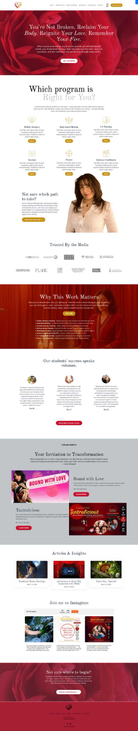
Concept 1
- Fonts: Headline in Playfair Display (classic, elegant, editorial); body in PS Sans (clean, modern).
- Hero: A still image of roses. This creates a strong, symbolic, and visually grounded opening — timeless and contemplative.
- Tone: Feels luxurious, romantic, and aligned with your archetype blend of Magician–Lover–Sage. It carries weight and sophistication.
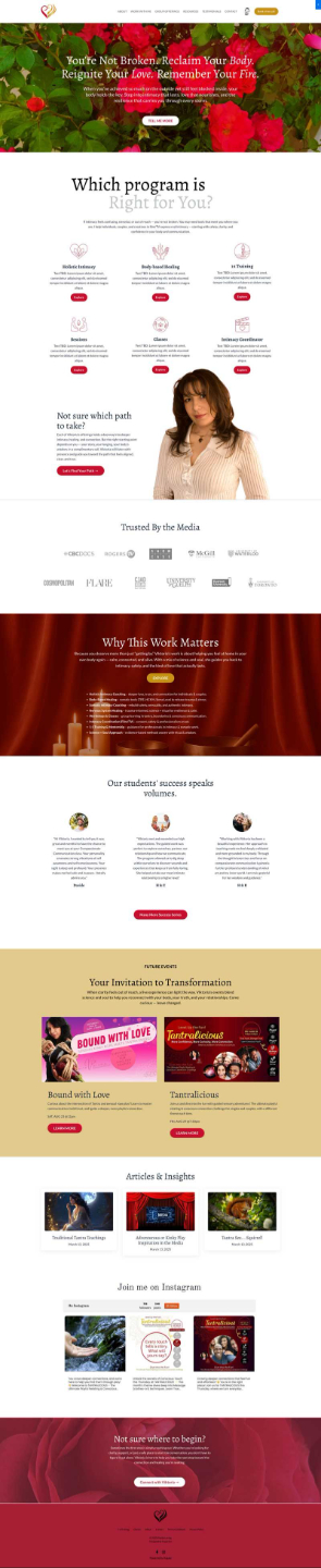
Concept 2
- Fonts: Headline in Alegreya (softer, more organic, slightly playful); body in Lato (highly readable, versatile).
- Hero: A looping video of roses. This adds motion, energy, and sensuality — it draws the visitor in with immediacy and flow.
- Tone: Feels more dynamic, modern, and approachable while still retaining depth and intimacy.
What stays the same in both:
- Structure and navigation flow, based directly on the approved wireframe. Click here to download the PDF
- Color palette direction: crimson, gold, silver.
- Content placeholders: you’ll provide draft bullet points for each page, and I’ll expand these into full keyword-rich copy.
What I’d like from you today:
- Your response to the overall feeling of each design. Which one feels more aligned with your brand vision?
- Your reaction to the typography pairings — Playfair/PS Sans vs Alegreya/Lato.
- Whether the static hero image or video better captures the tone you want visitors to feel immediately.
Website content:
- Provide the draft content using this document Viktoria Content Template.doc
