
Graphic Design: What are the primary, secondary and tertiary colors
Jul 01, 2020There is no escaping color. It is everywhere. And how you use colors in your graphic design will make or brake your work. But what does it mean? Why are people more relaxed in green rooms? Why do weightlifters do better in blue gyms? In this first instalment about colors, we will touch on some basics. In the second colors article I will talk much more about color psychology.
Despite the general lack of research in this area, the concept of color psychology has become a hot topic in marketing, art, graphic design, and other areas. Much of the evidence in this emerging area is anecdotal at best, but researchers and experts have made a few important discoveries and observations about the psychology of color and the effect it has on moods, feelings, and behaviors.
Of course, your feelings about color are often deeply personal and rooted in your own experience or culture. For example, while the color white is used in many Western countries to represent purity and innocence, it is seen as a symbol of mourning in many Eastern countries. Although different colors mean different things in different cultures, in general, the following is accurate.
Black color
Black means authority and power. It is always in style, and is popular in fashion as it makes people look thinner. Black also implies submission. Priests wear black to submit to god. Black outfits can also be overpowering, or make the wearer seem evil. Villains are often portrayed in black. Black is the color of the hidden, the secretive and the unknown, creating an air of mystery. It keeps things bottled up inside, hidden from the world.
White color
White is color at its most complete and pure, the color of perfection. The color meaning of white is purity, innocence, wholeness and completion. White symbolizes innocence and purity. This is why brides wear white. It is light, neutral, and goes with everything. White also shows dirt more easily, which is why doctors wear white to demonstrate their sterility and cleanliness.
Color theory is a practical combination of art and science that’s used to determine what colors look good together. Colors that look good together are called a color harmony. Artists and designers use these to create a particular look or feel.
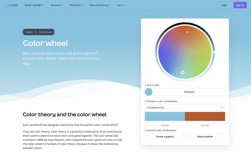
Click here -> Canva’s color wheel to find color harmonies by using the rules of color combinations.

3 Primary Colors
The primary colors, red, yellow and blue are the only three colors that can not be made by mixing any combination of other colors. All other colors are made from these three colors.
6 Secondary Colors
The secondary colors are green, orange and purple. These colors are created by mixing the primary colors.
12 Tertiary Colors
Tertiary colors are combinations of primary and secondary colors. There are six tertiary colors: yellow-orange, red-orange, red-purple, blue-purple, blue-green and yellow-green are the colors formed by mixing a primary and a secondary color (hence the names of the hues).
Red Color
Red is the most intense color emotionally. It increases heart rate and breathing. It is also the color of love, passion, action, ambition and determination. In decoration, red is usually used as an accent because it attracts attention. Red is also considered to be an appetite stimulant. Red can be associated with anger, but is also associated with importance (think of the red carpet at awards shows and celebrity events). Red also indicates danger (the reason stop lights and signs are red, and that most warning labels are red).
In graphic design, red is often used as a powerful accent color. It can also have an overpowering effect if it’s used too much in designs, especially in its purest form. It’s a great color to use when power or passion want to be portrayed in the design. Red can be very versatile, though, with brighter versions being more energetic and darker shades being more powerful and elegant.
Orange Color
Orange is also a vibrant and energetic color, but in its muted shades, it can be associated with the earth and with autumn. Because of its association with the changing seasons, orange can represent change and movement in general.
Because orange is associated with the fruit of the same name, it can be associated with health and vitality. In graphic design, orange commands attention without being as overpowering as red. It’s often considered more friendly and inviting, and less in-your-face.
Green Color
Green symbolizes nature. It is easy on the eyes and can help improve vision. People waiting to appear on TV often wait in green rooms to relax their nerves. Hospitals often place patients in green rooms to relax them. Green also symbolizes fertility. Dark green is masculine, conservative, and implies wealth (the color of money).
Green is a very “down-to-earth” color. It can represent new beginnings and growth. It also signifies renewal and abundance. Alternatively, green can also represent envy or jealousy, as well as a lack of experience (greenhorn).
Green has many of the same calming attributes that blue has, but it also incorporates some of the energy of yellow. In graphic design, green can have a balancing and harmonizing effect, and is very stable. It’s appropriate for designs related to wealth, stability, renewal, and nature. Brighter greens are more energizing and vibrant, while olive greens are more representative of the natural world. Dark greens are considered to be the most stable and often used as a characteristic of affluence.
Blue Color
Blue is the color of trust and peace. It can suggest loyalty and integrity as well as conservatism and frigidity. The color of the ocean and the sky causes the opposite reaction of red. Blue causes the body to produce calming chemicals. Blue can also mean cold and sadness. Studies show people are more productive in blue rooms. Blue is the most unappetizing color and can be an appetite suppressant.
Blue is often associated with sadness in the English language. Blue is also used widely to represent calmness and responsibility. Light blues can be refreshing and friendly. Dark blues are more strong and dependable. Blue is also associated with peace, and has spiritual and religious connotations in many cultures and traditions.
The meaning of blue is broadly affected depending on the exact shade and hue. In graphic design, the exact shade of blue you select will have a major impact on how your designs are perceived. Light blues are often relaxed and calming. Bright blues can be energizing and refreshing. Dark blues are excellent for corporate sites or designs where strength and reliability are important.
Yellow Color
Yellow attracts attention. Though it is considered a happy color, people more often use their tempers in yellow rooms, and babies will cry more in yellow rooms. It is a difficult color for the eye to look at, and can be overpowering. Yellow has also been shown to speed metabolism. Yellow is considered to be the brightest and most energizing of the warm colors. It’s linked with happiness and sunshine. Yellow can also be associated with deceit and cowardice, though (calling someone yellow is calling them a coward).
Yellow is also considered the color of hope, as can be seen in some countries when yellow ribbons are displayed by families who have loved ones at war. Yellow is also associated with danger, though not as strongly as red.
In some countries, yellow has very different connotations. In Egypt, for example, yellow is for mourning. In Japan, it represents courage, and in India it’s a color for merchants.
In your graphic designs, bright yellow can lend a sense of happiness and cheerfulness and at the same time it is considered to be the color of sales and low pricing. Softer yellows are commonly used as a gender-neutral color for babies (rather than blue or pink) and young children. Light yellows also give a more calm feeling of happiness than bright yellows.
Purple Color
Purple is the color of the imagination. It can be creative and individual or immature and impractical. Purple is the color of royalty. It is also feminine and romantic. Since it is rare in nature, it can appear artificial. Purple was long associated with royalty. It’s a combination of red and blue, and takes on some attributes of both colors. It’s also associated with creativity and imagination.
In Thailand, purple is the color of mourning for widows. Dark purples are traditionally associated with wealth and royalty, while lighter purples (like lavender) are considered more romantic. In design, dark purples can give a sense wealth, indulgence and luxury. Light purples are softer and are associated with spring and romance.
Some ancient cultures, including Egyptians and Chinese, practiced chromotherapy (using colors to heal).
In this treatment, red was used to stimulate the body and mind and to increase circulation. Yellow was thought to stimulate the nerves and purify the body. Orange was used to heal the lungs and to increase energy levels. Blue was believed to soothe illnesses and treat pain. Indigo shades were thought to alleviate skill problems.
Of course, most psychologist see color therapy with skepticism. Colors mean different things for different people and different cultures. Studies have also shown that feelings associated with color can be strong at first exposure, but dissipate over time.
Have a look at our article How to Choose the Right Colour Scheme for Your Website.