Serif Fonts: A Journey Through Typography
Aug 01, 2024Typography is more than the letters on a page — it’s the silent voice behind every piece of written communication. Whether you’re reading a novel, scrolling through a website, or browsing a menu, typography shapes your experience. It influences readability, mood, and even your perception of a brand. Among the many classifications of typefaces, serif fonts rank among the oldest, most iconic, and most enduring. Exploring their history and purpose can elevate your design work and help you make smarter typographic decisions.
The Birth of Typography
Typography as we know it began with Johannes Gutenberg in the mid-15th century. Before Gutenberg’s printing press, books were hand-copied by scribes — slow, laborious work that made books rare and costly. His invention changed everything. Suddenly, information could spread rapidly, literacy grew, and the world entered an era in which printed material became the foundation of education and culture.
Gutenberg’s early metal type was based on the handwritten Gothic scripts familiar in Europe at the time. These “blackletter” styles featured dramatic thick-and-thin strokes, sharp angles, and dense textures. While beautiful, they weren’t the easiest to read. As printing expanded across Europe during the Renaissance, designers and scholars sought typefaces that were more elegant, balanced, and readable. This search led to the birth of serif fonts — typefaces that would define the next several centuries of printed communication.
What Are Serif Fonts?
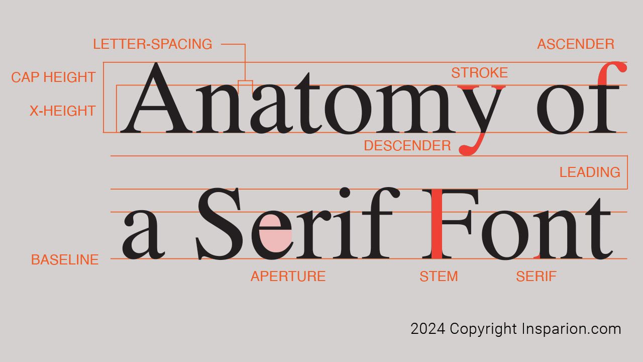
Serif fonts are defined by the small finishing strokes — called serifs — that appear at the ends of letterforms. These subtle extensions guide the eye from one letter to the next, making long-form reading more comfortable. That’s why books, newspapers, and academic publications rely heavily on serif typefaces.
Serifs introduce a sense of structure and sophistication. While sans-serif fonts feel modern and clean, serif fonts evoke tradition, trust, craftsmanship, and authority. They bring a rhythm to text that feels comfortable to the human eye, especially in print.
Ancient Roots and Timeless Influence
The concept behind serif fonts goes back far earlier than Gutenberg — to ancient Rome. Roman stonemasons carved inscriptions into monuments using letters that naturally developed serifs. Historians believe these small lines helped sharpen the edges of engraved letters, improved legibility, or were simply a byproduct of using brushes to paint guidelines before carving.
Regardless of the exact origin, Roman lettering became the foundation for Western typographic design. When Renaissance printers looked for inspiration, they found it in those same carved letters: sturdy, balanced, and beautifully proportioned.
From these beginnings, serif fonts evolved into several iconic classifications — Old Style, Transitional, and Modern — each reflecting the aesthetics and technological advances of its era.
Why Serif Fonts Work So Well
Serif fonts have remained relevant for centuries because they solve a fundamental problem: readability. Their shapes help form clear horizontal lines, creating a smoother reading experience. The serifs act like tiny visual anchors, assisting the eye in tracking from word to word.
Designers choose serif fonts for several reasons:
1. Long-Form Readability
Serifs guide the flow of text, making them ideal for books, magazines, and blogs with substantial copy.
2. Classic and Trustworthy Aesthetic
A serif immediately conveys credibility. That’s why financial institutions, law firms, and universities often use serif typefaces in their branding.
3. High-End and Elegant Tone
Serifs subtly signal refinement. They work beautifully in luxury branding, editorial layouts, and artistic publications.
4. Historical Continuity
They connect modern design to centuries of typographic tradition, giving designs depth and character.
Famous Serif Fonts and Their Personalities
Throughout history, certain serif fonts have become design staples. Each carries its own personality and purpose:
Times New Roman
Created for The Times newspaper in 1931, this typeface is efficient, compact, and optimized for dense text columns. Though often associated with academic papers, it remains one of the most recognized fonts worldwide.
Garamond
One of the oldest typefaces still in use, Garamond offers a warm, graceful feel. Its organic shapes and beautiful proportions make it a favourite among book designers.
Baskerville
Designed in the 18th century, Baskerville bridges Old Style and Transitional type. It is crisp, elegant, and highly legible—perfect for refined editorial work.
Georgia
Built specifically for digital screens, Georgia maintains the charm of classic serifs while staying sharp and readable at small sizes on modern displays. It’s an excellent choice for web typography.
Serifs in the Digital World
While print has historically been the natural home for serif fonts, digital typography has evolved significantly. High-resolution screens and improved rendering technology have made serifs just as viable online as they are in books. Many modern websites now use serif fonts for headings, body text, or branding to create a more distinctive and sophisticated look.
The key to using serif fonts online is balance. Too much ornamentation can become distracting on small screens, but well-designed serifs like Georgia or contemporary variable fonts retain excellent clarity.
When Should You Use Serif Fonts?
Use serif fonts when you want your design to feel:
- Trustworthy
- Traditional
- Elegant
- Academic
- Literary
- High-end
They work beautifully in:
- Books and eBooks
- Editorial layouts
- Long blog articles
- Luxury branding
- Invitations and formal print pieces
- Websites looking for a polished, timeless aesthetic
A Lasting Legacy
Serif fonts are more than decorative strokes—they’re a historical thread connecting early stone inscriptions to the digital interfaces we use today. Their combination of beauty, readability, and tradition has made them indispensable to designers for over 500 years.
Understanding where serif fonts come from and why they work gives you a deeper appreciation for typography’s role in visual communication. Whether you’re designing a website, a logo, a book layout, or a social post, the right serif font can elevate your message and make your work feel timeless.