Website Redesign for Halford.co (Kajabi Platform)
Feb 12, 2024Overview
Halford.co, a leadership development and governance training firm, needed a complete website redesign to modernize its digital presence, clarify its messaging, and improve the user experience on the Kajabi platform. The previous site was visually outdated, cluttered, and difficult for users to navigate — ultimately limiting engagement and undermining the professionalism of the brand.
The Challenge
Several issues were holding the site back:
- Outdated Visual Design: The look and feel no longer reflected the premium level of Halford.co’s services. The layout was dense, dark, and visually heavy.
- Poor Navigation Structure: The menu and page structure made it hard for users to understand what Halford.co offered or to find key information quickly.
- Lack of White Space: Tight spacing, competing visual elements, and inconsistent section flow created a cluttered, overwhelming experience.
- Inconsistent Typography: Mixed type styles affected readability and weakened the professional tone of the site.
All of these issues combined to create friction for visitors and diluted the brand’s authority.
The Solution
The redesign focused on simplicity, clarity, and modern brand alignment. The site was rebuilt on Kajabi using a clean visual system and a strategic content layout. Core improvements included:
1. A Modern, Clean Look & Feel
- Introduced a lighter, brighter aesthetic aligned with the brand’s updated palette.
- Integrated high-quality photography and intentional layout spacing.
- Created a clear visual hierarchy to guide users through the content effortlessly.
2. Streamlined, Intuitive Navigation
- Reorganized the site structure to improve discoverability of services and resources.
- Added stronger call-to-action placements to guide users toward key offerings.
- Reduced the cognitive load by removing unnecessary menu items and visual noise.
3. Expanded Use of White Space
- Generous spacing improved readability and reduced clutter.
- A more open layout allowed content, testimonials, and visuals to stand out instead of fighting for attention.
4. Simplified, Cohesive Typography
- Standardized the typography system across the entire site.
- Choose fonts optimized for readability and brand professionalism.
- Improved text hierarchy so visitors could scan and absorb information faster.
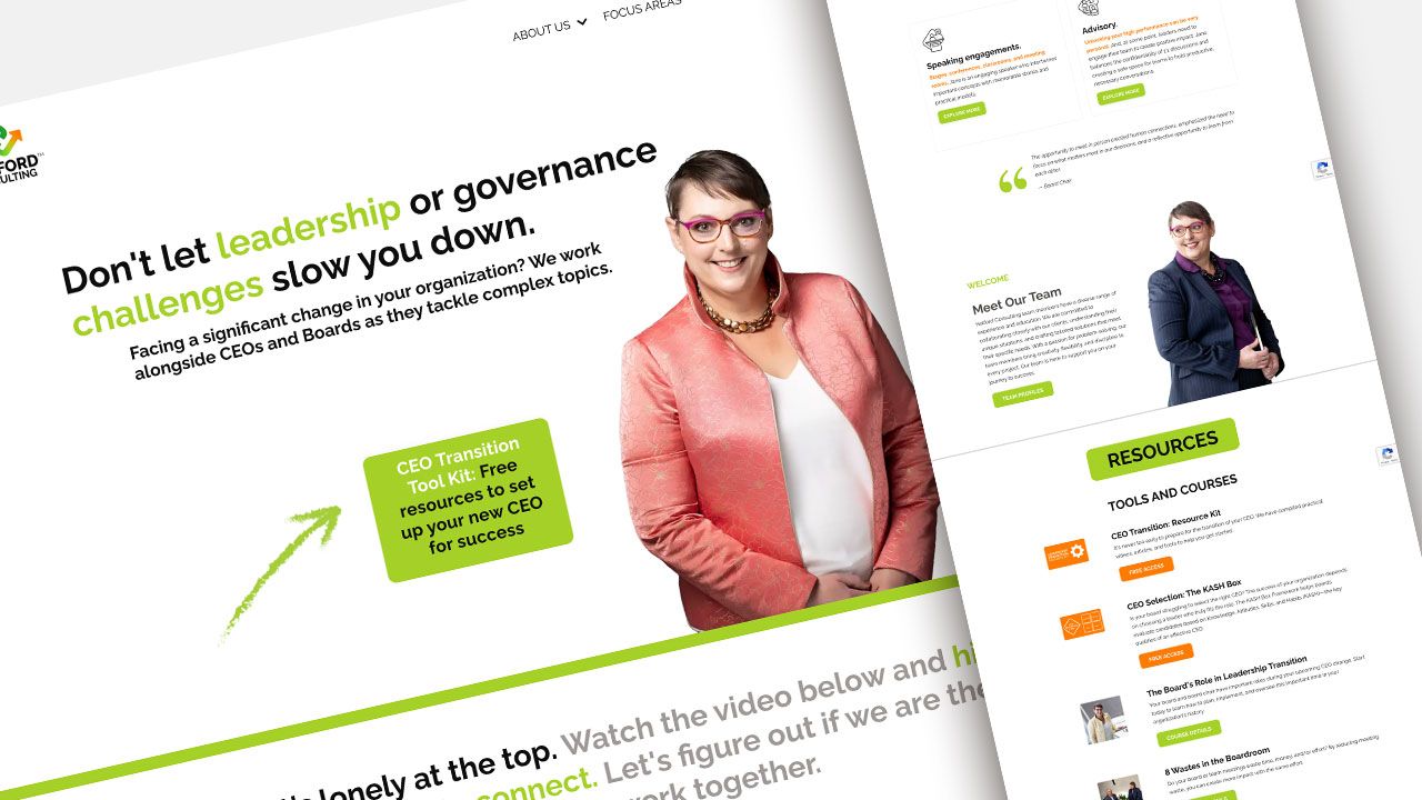
Before & After
The redesigned site is a complete transformation — from a dark, compressed layout to a clean, modern, brand-aligned experience. The new design makes Halford.co feel current, credible, and accessible, while also strengthening user trust and engagement.
Results
The redesign delivered immediate improvements:
- Clearer content layout, leading to faster comprehension and easier decision-making for users.
- Higher engagement, thanks to improved visuals, stronger messaging flow, and well-placed CTAs.
- A smoother browsing experience, supported by intuitive navigation and cohesive design.
- A refreshed digital identity that matches the high level of Halford.co’s leadership and governance expertise.