Why You Keep Rebuilding Your Website
Jul 13, 2026If this is the second, third, or fourth time you've redesigned your website this year, I want to stop you before you do it again.
Not because your website doesn't need work. It might. But if the pattern is "rebuild, feel better for a few weeks, then feel off again, then rebuild" — the problem was never the website. And if you don't find the actual problem, the next rebuild will end exactly where this one did.
I've watched this happen with enough business owners to recognize it immediately. It has a shape. Once you see the shape, you can stop repeating it.
The Loop
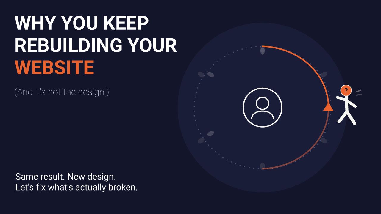
It usually goes like this.
You launch a new site. For a week or two, it feels great — cleaner colors, a better template, finally something that "looks professional." Then the feeling fades. You start noticing things again. The homepage doesn't quite say what you do. The layout feels cluttered even though you just simplified it. Something about it still feels off, but you can't name what.
So you start looking at templates again. Maybe a new platform this time. Maybe a designer. You tell yourself the last one just wasn't quite right, and this next version will finally be it.
Six months later, you're doing it again.
If you've lived this loop, you already know the frustrating part isn't the time or the money — it's that each rebuild feels like progress while you're in it, and only later do you realize you're back where you started, just with a different color palette.
Why the Website Was Never the Problem
Here's what's actually happening in almost every case I've seen: the business owner is trying to solve a message problem with a design solution.
A website is not neutral. It doesn't create clarity — it reflects clarity that already exists. If you're clear on what you offer, who it's for, and what makes you different, a website communicates that clearly, and it's genuinely hard to make it feel "off." If you're not clear on those things yet — if the offer has shifted twice this year, or you're still half-guessing at who your ideal client actually is, or you haven't quite settled on how to describe what you do without a run-on sentence — no template will fix that. It'll just wear the confusion in a new outfit.
This is why a rebuild feels good at first. New design genuinely does hide unclear messaging for a little while — fresh colors and a new layout are a real, if temporary, distraction. But the underlying uncertainty doesn't go anywhere. It resurfaces the moment the new-template excitement wears off, and it always resurfaces as "something feels off about my website," because that's the only language most people have for the discomfort.
This isn't just my own observation. Nielsen Norman Group's research into how people form first impressions of a website found that visitors size up relevance, credibility, and even usability almost instantly — and that if a site requires real mental effort just to figure out what it's for, people become suspicious of it rather than curious about it. That reaction isn't caused by weak design. It's caused by an unclear message wearing a website.
I've said this before and I'll keep saying it: most online businesses don't have a technology problem. They have a clarity problem. The technology is just where the clarity problem becomes visible.
A Short Self-Check
Before you touch a website builder again, sit with these honestly:
Can you describe what you offer in one sentence, without qualifiers?
Not "I help people with their business, kind of in a few different ways depending on what they need" — a real, specific sentence. If you can't, that's the gap. No layout will patch it.
Has your offer changed in the last six months?
Not refined — changed. If you're still actively deciding what you sell, a website redesign is premature. You'll be designing around a moving target, which is exactly why it never feels finished.
Do you know exactly what you want a visitor to think in the first five seconds?
When you imagine your ideal visitor landing on your homepage, is the answer clear in your own head? If the honest answer is "I'm not sure," that's not a design gap. That's a messaging gap wearing a design costume.
Did the last redesign start with a strategy conversation, or with browsing templates?
If it started with templates, that's usually the tell. Templates answer "how should this look." They don't answer "what should this say, to whom, and why."
If you answered honestly and at least two of these gave you pause, a new template isn't your next move. Clarity is.
What to Do Instead of Rebuilding Again
Resist the urge to open a website builder. I know that's counterintuitive when the site is the thing that feels wrong — but going straight to design again just restarts the loop.
Start one step back. Get specific, on paper, about three things: what you actually offer, who it's genuinely for, and the one outcome you want a visitor to walk away understanding. Not a paragraph. Three plain sentences, the kind you could say out loud to a stranger and have them immediately get it.
If you can write those three sentences cleanly and they feel true — not aspirational, true — you're in a very different position than you were before. Now a redesign has something solid to build around, and it has a real chance of being the last one for a while.
If you sit down to write those three sentences and find yourself stuck, rewriting, or unsure — that's useful information too. It means the work right now isn't design work. It's clarity work. And that's worth doing properly, with someone outside your own head, before a single page gets built.
That's the actual starting point for almost every website project I take on. Not "what should this look like," but "what does this need to say, and to whom." Design comes after that's settled — never before.
If you recognize yourself in this loop and want a second pair of eyes on where the clarity gap actually is, that's exactly what a strategy session is for. Book a clarity session before you rebuild again — it's a lot cheaper than another redesign.